Cosmic
1. Problem
Cosmic Sound was known for high-quality audio work but its old brand identity no longer matched the studio’s creative reputation. The logo lacked character, and the website didn’t showcase projects or communicate the studio’s premium positioning. For a sound design company collaborating with global clients, a stronger, more distinctive visual presence was essential.
2. Process
We began with research into sound and entertainment branding, mapping visual directions that could represent rhythm, movementand cosmic energy. The logo exploration balanced minimalism with distinctiveness, leading to a flexible, bold mark paired with clean typography.
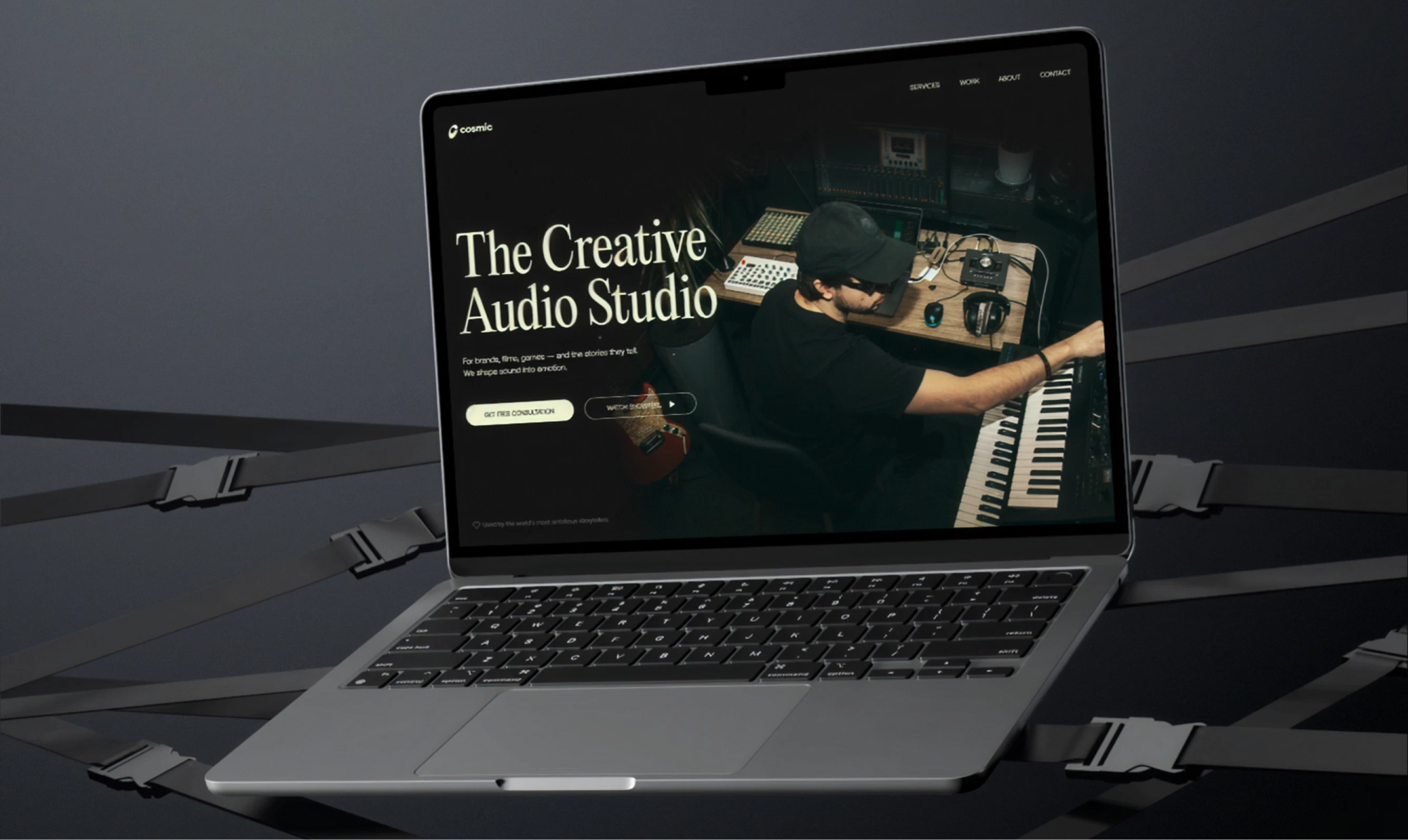
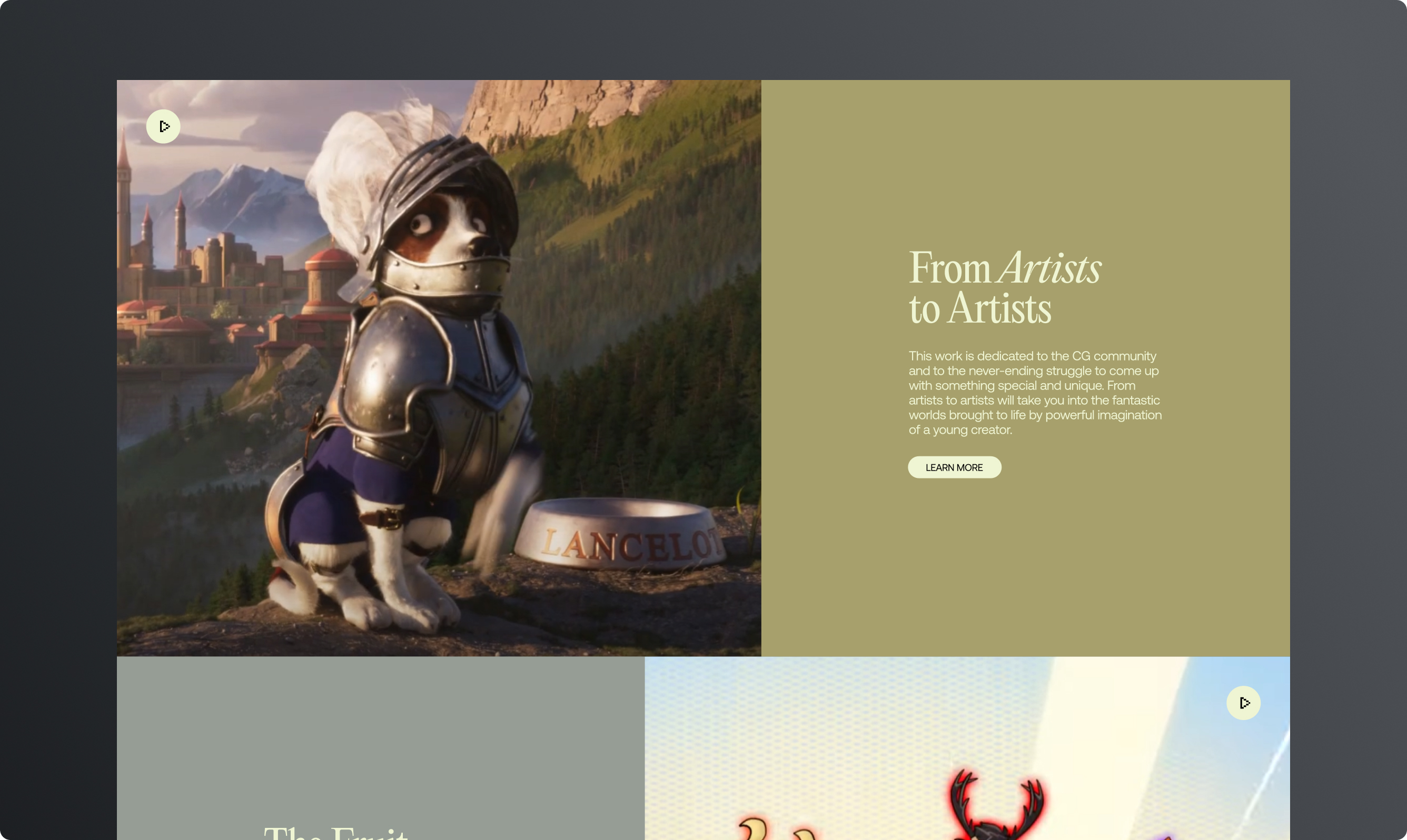
For the website, we restructured content around storytelling — with modular blocks for projects, collaborations, and services. The design combined bold type, earthy color palettes and immersive imagery, reflecting the emotional depth of sound.

3. Solution
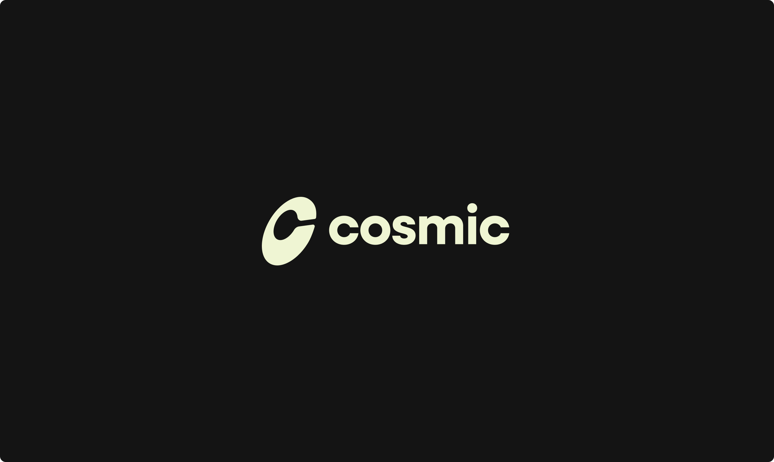
The new logo is minimal yet expressive, symbolizing both “C” for Cosmic and the flow of sound waves. The redesigned website presents projects like films, games and motion courses in a structured but cinematic way.
The identity feels premium, approachable and aligned with the studio’s creative edge.

4. Result
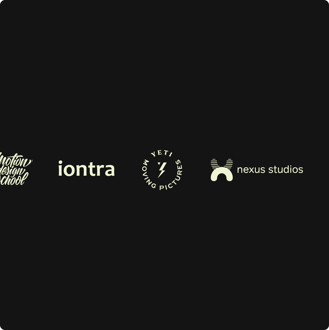
Cosmic Sound now has a brand identity and website that match its world-class sound design work. The refreshed visuals strengthen credibility, attract new collaborations, and help the studio stand out in the competitive creative industry.
MORE WORKS