Lightspeed
1. Problem
The UK broadband market is saturated with providers offering similar plans, interfaces and user experiences. Most of brand lack a distinct visual identity, making it harder for new entrants to stand out. ,The installation booking process for customers is often unnecessarily complex and fragmented between customer and technician systems.

2. Process
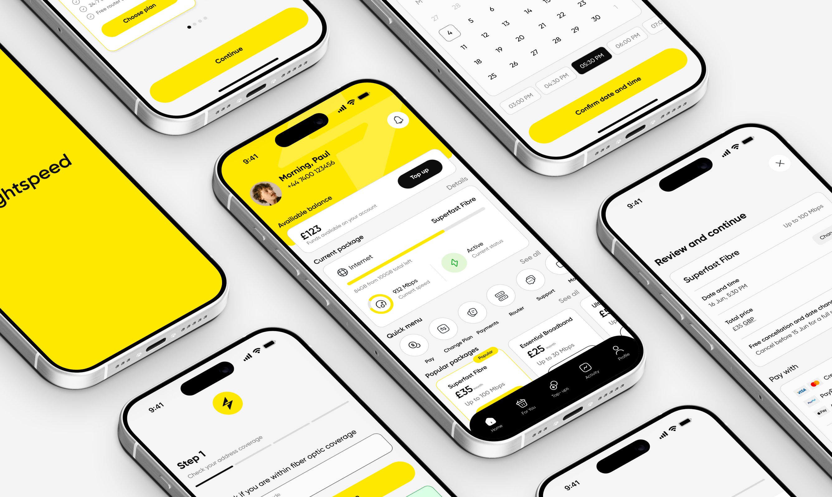
We started from scratch - developing the logo, brand style and interface design. Competitor research revealed a gap for a vibrant, modern visual language, leading to the decision to adopt a bright yellow palette.


3. Solution
For customers, the app delivers a fast, frictionless onboarding flow. Each step is minimal in design yet rich in feedback, guiding the user without unnecessary complexity.
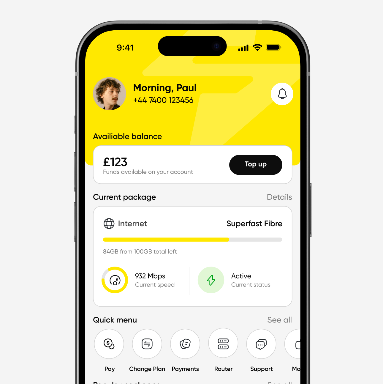
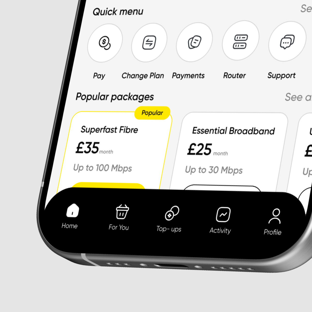

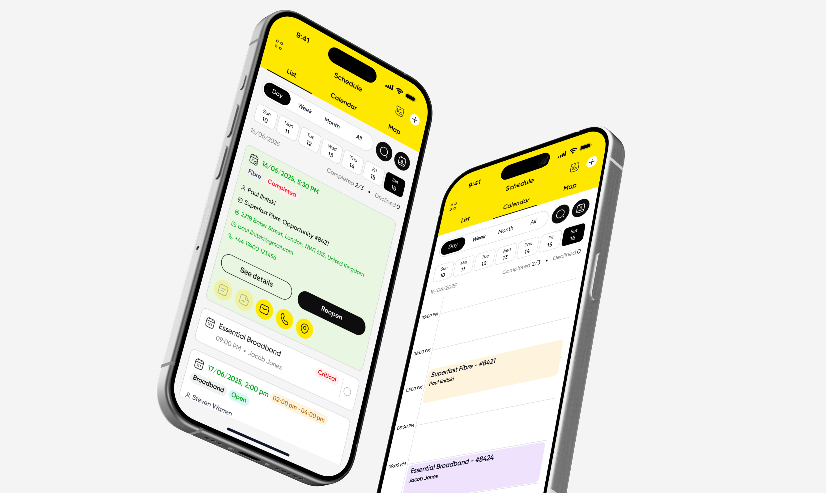
For technicians, the scheduling tool is streamlined — allowing manual approval of new appointments, quick access to customer details, and one-tap status updates. The visual system is consistent across both sides, reinforcing brand recognition.


4. Result
The concept positions Lightspeed as a confident and modern broadband provider with a bold visual presence. The app design reduces booking friction for customers and improves operational efficiency for technicians — bridging the gap between brand experience and service delivery.
