Ocebus
1. Problem
Passenger transport providers in Europe often lack a distinctive and modern identity. Many brands appear outdated, overly corporate or fragmented across digital and physical touchpoints. Ocebus needed a clear name, strong positioning and a contemporary brand language to differentiate itself in a crowded market and to establish trust with both daily commuters and occasional travelers.
2. Process
We began with naming explorations, focusing on short, rhythmic words that convey speed, movement and flow. “Ocebus” was chosen for its simplicity, international readability and subtle reference to continuous travel.
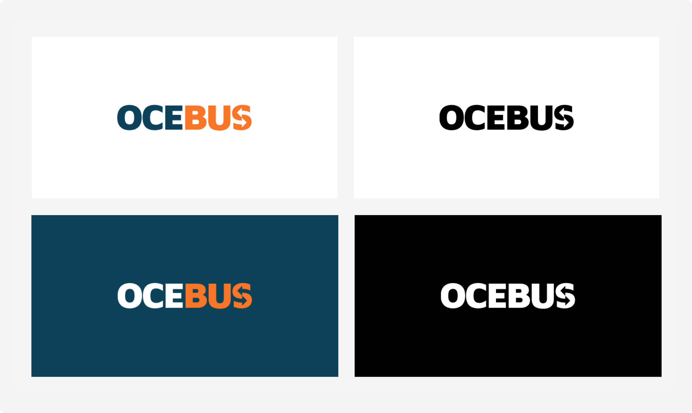
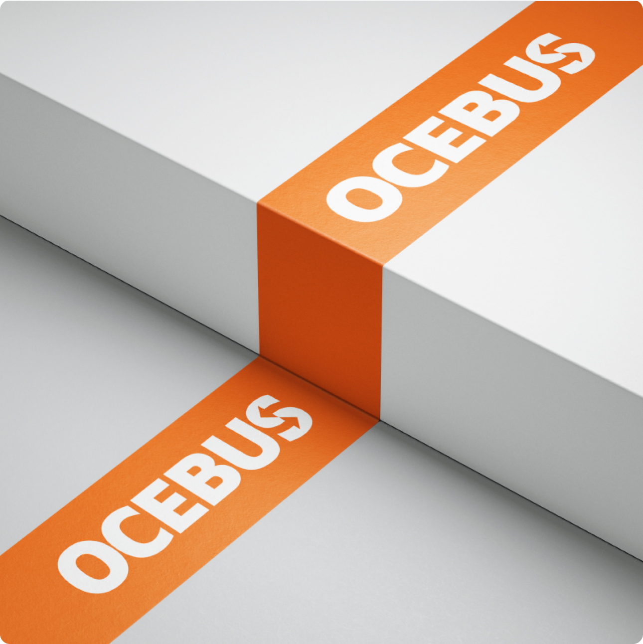
The brand identity was built around minimal typography, a clean blue-orange and white palette, and a logo system adaptable to both print and digital use. Positioning statements were developed to emphasize reliability, accessibility and a modern passenger experience.

3. Solution
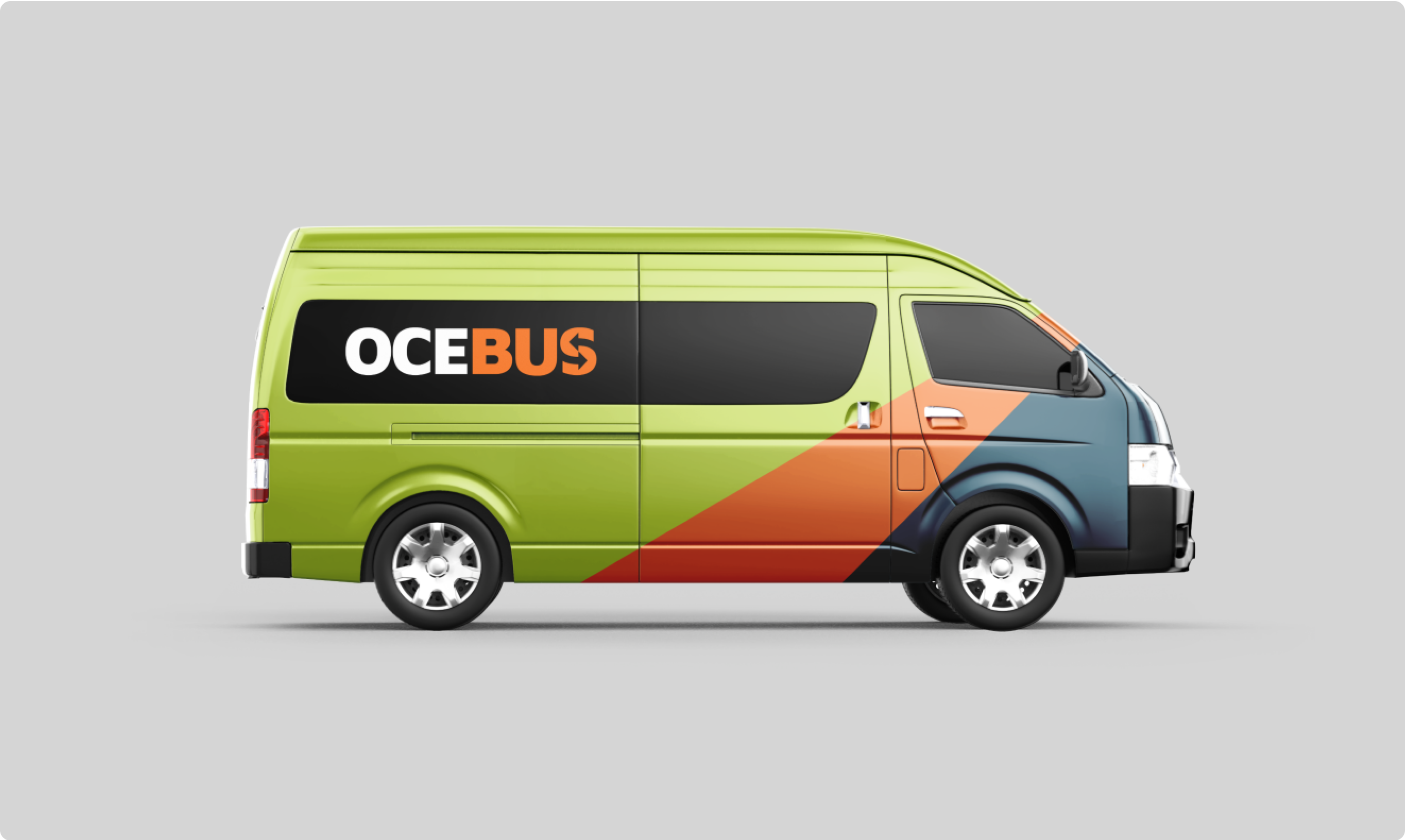
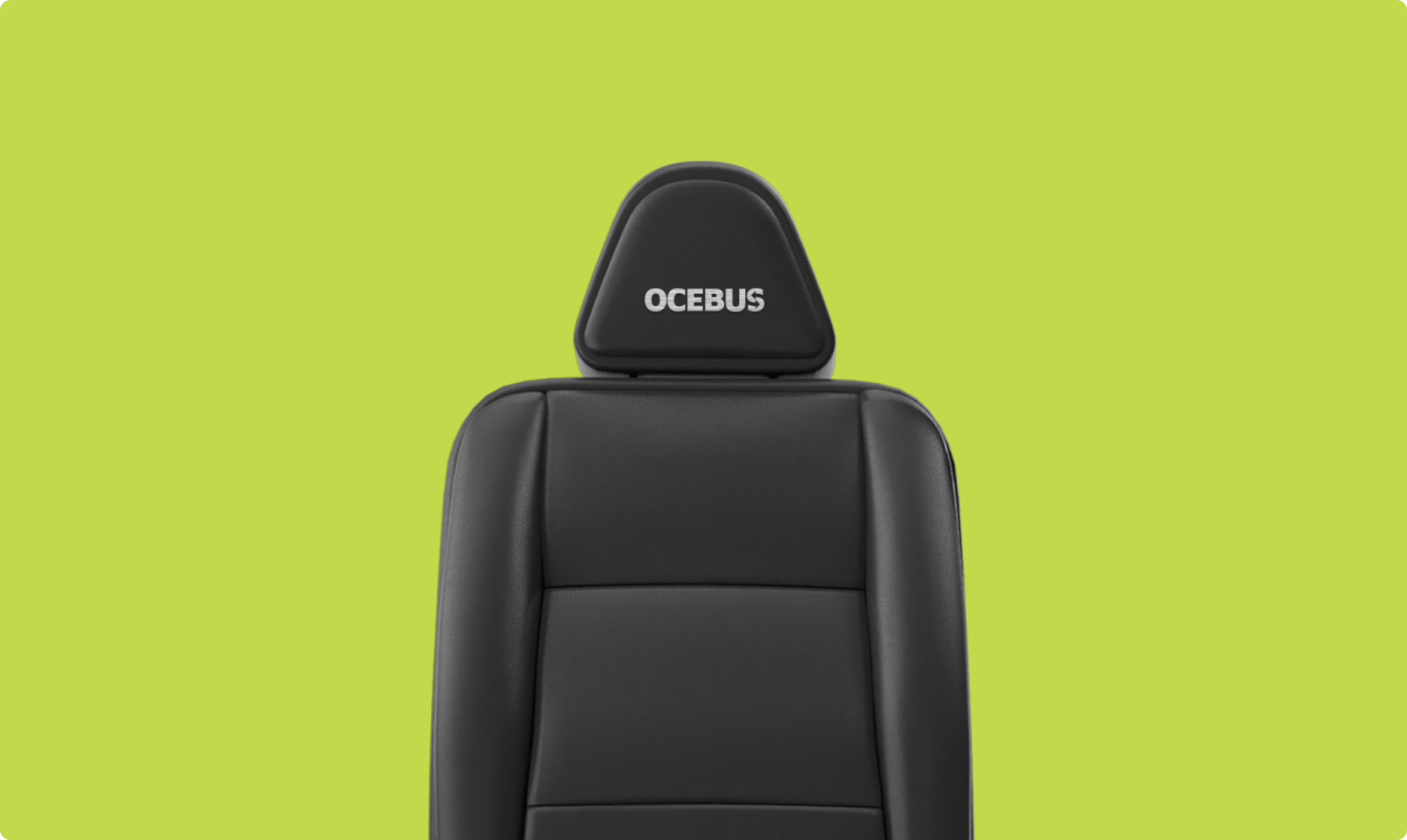
The final identity communicates Ocebus as a forward-thinking transport provider — professional yet friendly. The visual system balances clarity and boldness, ensuring recognition across multiple touchpoints,
from buses and tickets to digital platforms. The landing page delivers an easy booking experience while reinforcing the brand’s modern tone of voice.
4. Result
Ocebus launched with a cohesive brand and digital presence thatsets it apart from competitors. The clear name, confident branding and streamlined website create a foundation for growth and customer trust.
MORE WORKS